A few Quick Words about the New Design Practices
We always talk about SEO, PHP, Frameworks, Database, and all that jazz, but why not add some color into our lives? 🙂 Let’s talk some design now. Most of you have seen a clear change in design practices, that now respect responsive design and HTML5 & CSS3 capabilities a hundred percent. I am not a guy big on design myself, but i realized the need of knowing a few responsible design methods (graphically speaking) so i can serve my clients without needing to hire another designer for a bigger price, losing the total amount of money that i receive from the said client.
Fads changed from animated gif’s, flash pages, curved menu borders, to more concentration on content, simplistic but tasteful design with 3G connections in mind, and heavy javascript functionality, putting all the work on the browser’s back. I think of this as a huge improvement since thousands of clients can handle each of it’s data on the server much better than server itself (it is actually a bandwidth problem, where the server has to send the whole file, instead of updating the existing data on the client’s browser at a much lower upload/download cost), helping both the client and the server at the same time.
I’ve noticed these design practices much more heavily on the HTML5 templates and the websites that use them around the Internet. It amazed me how efficiency was combined with tasteful design! 🙂
So let me present the newest design practices to you, with the comfort of your home 🙂
1. Subtle Patterns
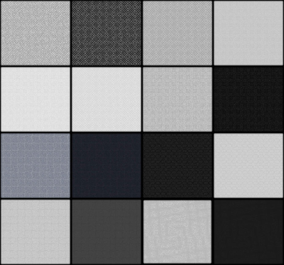
Subtle patterns are nothing new to the Internet and design outside the Web, but it soon gained popularity especially with WordPress templates. You can add some of these to make your post heading backgrounds or article backgrounds look slick and beautiful, while saving up on resources like memory and bandwidth. most of these come in simple 20×20 sizes, and you can use the CSS background property to repeat them on the said space using the x-repeat value right next to the background url.
I have always considered using full images for backgrounds (there are sliders for presenting images, people.) a bad practice, and these patterns never failed to provide me a quick solution to add a main color to the website.
2. Limited Color Swatches

Have you ever seen one of these websites with too much colors like the designer ate different color marshmallows, puked them on the screen and recreated it on Photoshop? Or he ate too many magic mushrooms that night?
Well, you might want to avoid that sort of thing by using a limited set of colors to use on the page, like background one color, menu’s one color, article backgrounds one color, and the widgets last color with the text in a matching color. It simply looks much slicker and doesn’t put heavy workload neither on the Internet connection nor on the server that sends the files. Also, instead of using image gradients, you can check out CSS gradients at CSS gradient generator. It creates all browser compatible CSS with your preferred color pair.
3 – Emphasis on Content

Designers and developer know for fact that users come to a website to get information, and take actions instead of looking at the pretty images and cool menu’s with widgets. That’s why there is so much attention given to content nowadays, to feed the customer’s hunger for that information, making it easier to learn about the product they sell and the methods for obtaining it. This doesn’t mean that you should build a wall of text and stick together a bunch of links and ship it, no, that looks unprofessional, but you should not put all the emphasis on the surface, and take care to not leave out any important information. One good exercise is, to pretend you are the visitor of your website, and ask yourself questions about the product you are selling. Then organize answers to that question and put it in an orderly fashion where even your grandma can click and get her info easily.
4 – Minimalism

Long gone the days of loads of “cool” plugins and ten thousands of lines of content and “cute” colors… Let’s play safe and assume the worst for the benefit of your page ranking. Imagine that your user has a 128 kbps modem connection, a half-broken monitor and his browser can’t parse anything other than text, images and CSS gradients. Now you’re good to go. If you’ve seen HTML5 templates before (and if you do anything related to the web, you really should), you will notice that they don’t include more than 5 colors, all the patterns are in 25×25 maximum size (or done in using gradients) and little bit of jQuery for functionality. The data is put on the client browser’s shoulder, only to be updated when the user requests the newest information. This makes slick, functional, and beautiful web pages that users will adore revisiting whenever they want some more. And with the risk of sounding cliche and repetitive, just concentrate on one thing most time:
Functionality.
You’ll see on the entire web, sites that are plain ugly (think Craigslist) that have so much use to the users that they don’t even care about it’s looks. It gives the user what he wants in a pragmatic fashion, and that’s it. These kinds of websites are socially promoted over continents and never feel the need to update their looks because they get enough market share.
If we think about it, there might be times where excessive design (especially UX design) can hinder ease of learning curve, making it steeper than it should be, encouraging users to give up. Don’t take it as me discouraging the action of giving your users a better interface to do their stuff on, rather, follow the KISS principle (meaning, Keep it simple, Stupid), always try your hardest to provide clear & concise interfaces with a slick design, and add features periodically.
See you soon!


Comments